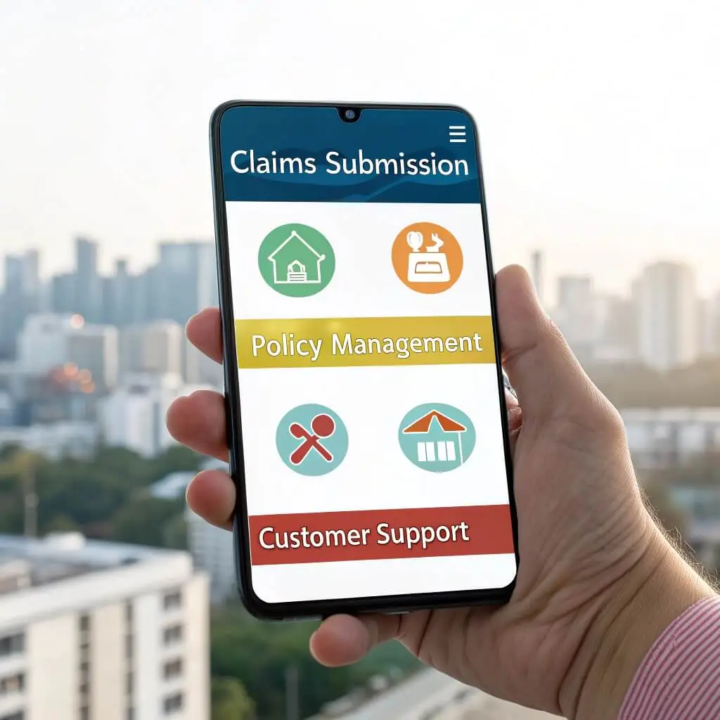
Let’s talk about a user experience crisis that is so common in insurance apps. If you are an insurer, you already see what I mean. If you are an insurance company manager or owner, here are some stats: 73% of insurance shoppers abandon their applications before completion. That costs the industry billions annually.
This pushes a lot of companies to seek insurance application development services. In this article, we will break down the crucial user journeys you need to implement to transform your app from an abandoned download into a customer acquisition hub.
Journey 1: The Quote Request Flow
Your quote flow is your digital handshake. Users judge your entire company within the first 30 seconds of interaction. A smooth quote experience signals trustworthiness and competence. A clunky one suggests they’ll face headaches later when they need help.
Common Breakpoints:
- Most insurance apps fail because they dump 15-20 form fields on users immediately.
- Progressive Insurance’s internal data shows that every additional field above 8 in the initial screen reduces completion rates by 12%.
- Users also abandon when pricing appears arbitrary or when they can’t easily compare coverage options side-by-side.
What Users Need:
- Progressive disclosure: Smart apps reveal information gradually. Start with basic details like zip code and property type, then expand based on those answers.
- Real-time price updates: Users want to see prices adjust in real-time as they modify coverage levels.
- Easy comparison tools: They also need clear visual comparisons between plan options, not dense text tables.
The Fix: Step-by-step breakdown of a friction-free quote flow
Step 1: Collect only essential information (4-5 fields max)
- Property address
- Property type
- Desired coverage start date
Step 2: Show initial price range immediately with a visual slider
- “Your estimated monthly premium: $85-$125”
- Let users adjust coverage amounts with sliders
- Price updates instantly as they move controls
Step 3: Progressive disclosure for additional details
- Reveal sections only when relevant
- Use smart defaults based on previous answers
- Save progress automatically
Step 4: Visual comparison of final options
- Side-by-side cards showing coverage differences
- Highlight recommended option with clear reasoning
- One-click selection and immediate next steps
Journey 2: Claims Filing & Photo Upload
Claims filing happens during users’ worst days. Their car crashed, their house flooded, or they’re dealing with medical emergencies. The last thing they need is technical friction from your app. This moment defines whether they renew their policy or switch to a competitor.
Common Breakpoints:
- Photo quality rejections – Users take photos with shaky hands and poor lighting, then get frustrated by automated rejections.
- Confusing documentation requirements – They don’t know what documents to gather or in what order.
- Status black holes – Worst of all, they submit everything and hear nothing back, creating anxiety about whether their claim is progressing.
What Users Need:
- Smart photo guidance – The app should coach users through photo requirements with real-time feedback.
- Clear checklists – Show them exactly what documents they need before they start gathering paperwork.
- Proactive status updates – Send proactive updates about claim status, even if it’s just “We received your photos and they look good.”
The Fix: Build an empathetic claims flow
Smart Photo Capture:
- Real-time overlay showing exactly what to photograph.
- Automatic quality check with helpful suggestions: “Try moving closer to the damage.”
- Multiple photo options if the first attempt fails.
Clear Documentation Checklist:
- A dynamic list that updates based on claim type.
- Visual examples of acceptable documents.
- Option to add documents later if not immediately available.
Proactive Communication:
- Automated confirmations within 2 hours.
- Daily status updates during active review.
- Clear explanation of next steps and expected timelines.
Journey 3: Policy Management & Changes
Policy management is where customers decide whether to stick with you long-term. When users can’t easily understand their coverage or make changes, they shop around.
Common Breakpoints:
- Hidden options – Users get frustrated when they can’t find basic information about their policy.
- Unclear pricing impacts – They abandon changes when they can’t see how modifications affect their premium before committing.
- Phone-call requirements – If changing coverage requires calling customer service, that might be a signal to leave for a good fraction of your customers.
What Users Need:
- Clear policy visualization – Transform dense policy documents into visual, interactive displays.
- Instant pricing for changes – Let users modify anything online with immediate price impacts displayed clearly.
- Self-service everything – Show coverage limits with progress bars or visual representations.
The Fix: Make complex policy data digestible and actionable
Visual Policy Dashboard:
- Coverage amounts are shown as filled bars with limits.
- Clear icons and colors for different coverage types.
- At-a-glance summary of key dates and amounts.
Interactive Change Experience:
| Change Type | Self-Service Capability | Price Impact Display |
| Coverage limits | Real-time sliders | Instant premium update |
| Deductible amounts | Dropdown selection | Monthly/annual impact |
| Add/remove coverage | Toggle switches | Breakdown of cost changes |
Instant Pricing Calculator:
- Show the monthly and annual impact of changes;
- Highlight savings opportunities;
- One-click implementation with confirmation.
Journey 4: Payment & Billing Experience
Failed payments lead to policy lapses, which trigger expensive win-back campaigns. Smooth billing experiences, on the other hand, enable flexible payment plans that increase customer satisfaction and reduce churn.
Common Breakpoints:
- Payment failures – Credit card failures happen 15% of the time in insurance payments due to expired cards, insufficient funds, or bank security holds.
- Unclear billing cycles – Users get confused about billing cycles, especially when they switch mid-term.
- Limited payment options – Limited payment options force some users to call customer service monthly.
What Users Need:
- Flexible payment methods – Offer multiple payment methods including ACH, digital wallets, and installment plans.
- Clear billing communication – Send clear, visual billing summaries before charging.
- Failure recovery – Create automatic recovery flows for failed payments instead of immediately sending threatening notices.
The Fix: Build a payment flow that prevents and recovers from failures
Payment Method Flexibility:
- Support 5+ payment types including Apple Pay, ACH, and split payments
- Let users set up automatic backup payment methods
- Offer flexible installment plans
Proactive Failure Prevention:
- Send card expiration reminders 60 days in advance
- Automatic retry logic with 3-day delays
- SMS/email alerts before attempting payment
Smart Recovery Flow:
- Immediate alternative payment options after failure
- Grace period with a clear deadline
- One-click update for expired cards
Journey 5: Emergency & Urgent Support Access
Users in crisis situations will remember forever how easily they could reach help. These moments create the strongest positive or negative brand associations.
Common Breakpoints:
- Buried contact info – Users in emergencies can’t find phone numbers.
- Chatbot dead ends – They get stuck in chatbot loops asking about non-urgent topics.
- After-hours gaps – After-hours support often routes to generic call centers that can’t help with claims or policy questions.
What Users Need:
- Instant human access – Ensure 24/7 human access for genuine emergencies, even if it’s just to triage and schedule follow-up.
- Location-aware services – Use location data to connect users with local services.
- Crisis-specific flows – Create dedicated emergency flows that bypass normal navigation.
The Fix: Design for panic
Prominent Emergency Access:
- Red “Emergency” button on every screen
- Voice-activated help (“Hey [App Name], I need help”)
- Shake-to-call feature for truly urgent situations
Smart Triage System:
- Location-aware emergency services integration
- Clear options: “I need immediate help” vs “I need to file a claim”
- Skip-ahead options for verified urgent situations
24/7 Human Backup:
- Live chat with humans during business hours
- After-hours emergency line with real people
- Automatic escalation for crisis keywords
Priority Framework — Which Journey To Tackle First
- Quote flow: Focus here if acquisition is your main goal.
- Claims filing: Start here if retention drives your strategy.
- Payment experience: Choose this for the fastest ROI due to direct cash flow impact.
Tools for continuous optimization:
- Heatmap analytics to identify friction points.
- A/B testing for all major flow changes.
- Monthly user interviews focusing on emotional experience rather than just functional feedback.